Client
Honey Stinger
Creating a new identity for a loved and trusted sports nutrition brand.
Nature's Performance Fuel
Our research and strategy helped Honey Stinger understand how to reach a more mainstream audience, while staying true to their roots and core superfans.
Deliverables
- Consumer Research
- Competitor Analysis
- Workshop Facilitation
- Target Audience Identification

But First, a New Logo
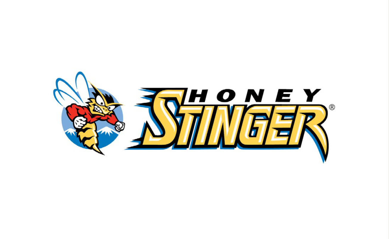
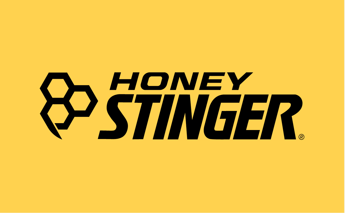
We transformed their complex logo into a simple, bold mark that looks hot on everything from athlete jerseys to swag to packaging.
For brand continuity, we refined their original, hand-done type by removing the "stingers" and improving the letterforms.
Deliverables
- Logo
- Color & Type
- Positioning & Messaging
- Brand Guidelines

We’re all really impressed with the Walden Hyde team. They worked hard to make everyone feel heard, while still offering creative expertise.
Honey Stinger Co-Founder
And Cohesive Packaging
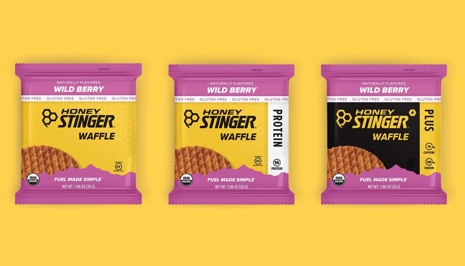
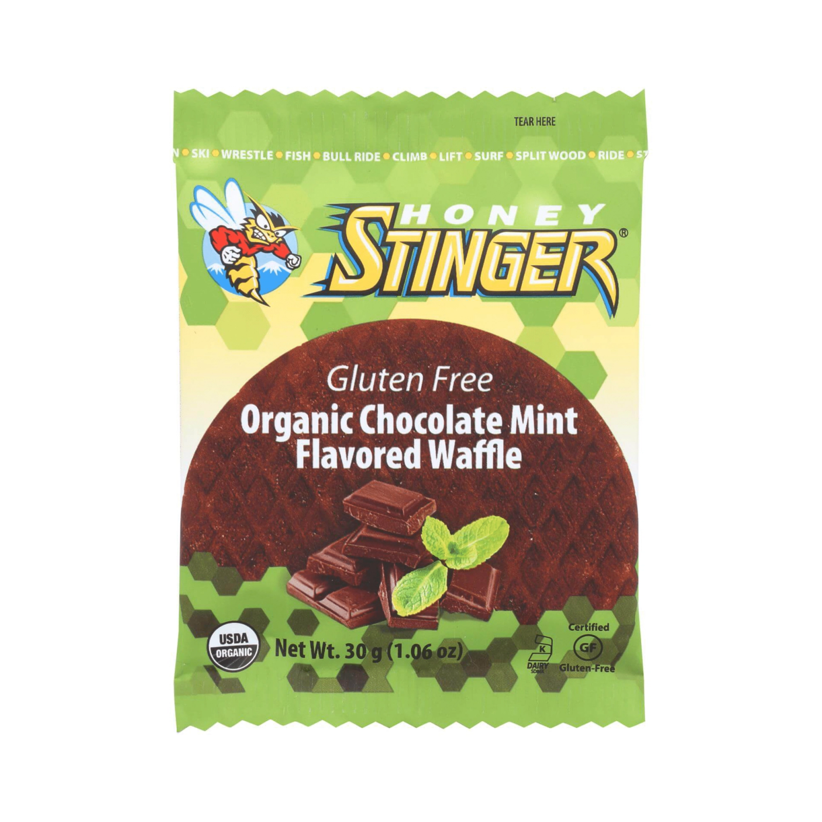
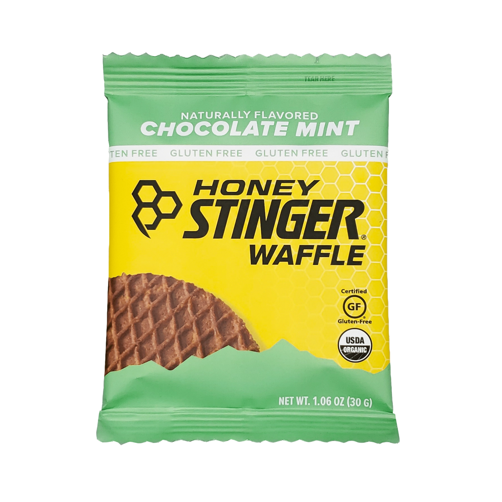
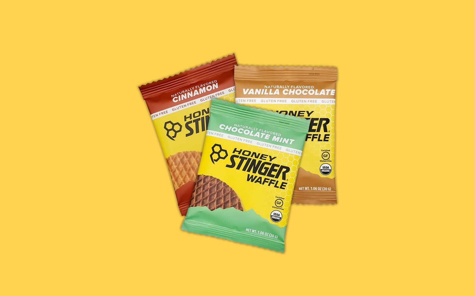
Honey Stinger's busy packaging often got lost at shelf. We simplified the design and introduced strong information hierarchy and visual cues to help consumers shop quickly and effectively.
As a result of this work, we produced a 104% increase in sales lift.
Deliverables
- Information Hierarchy
- Design Concepts
- Packaging Harmonization
- Design for X SKUS
- Template Files with Rules
- Proofing
Lift Rate Increase