Our field research showed a growing trend of athletes using "real food" to power sports performance, but honey was strangely absent from the conversation—and competitor offerings. We knew then Honey Stinger had a huge opportunity to position honey as a natural performance fuel.
But First, a New Logo
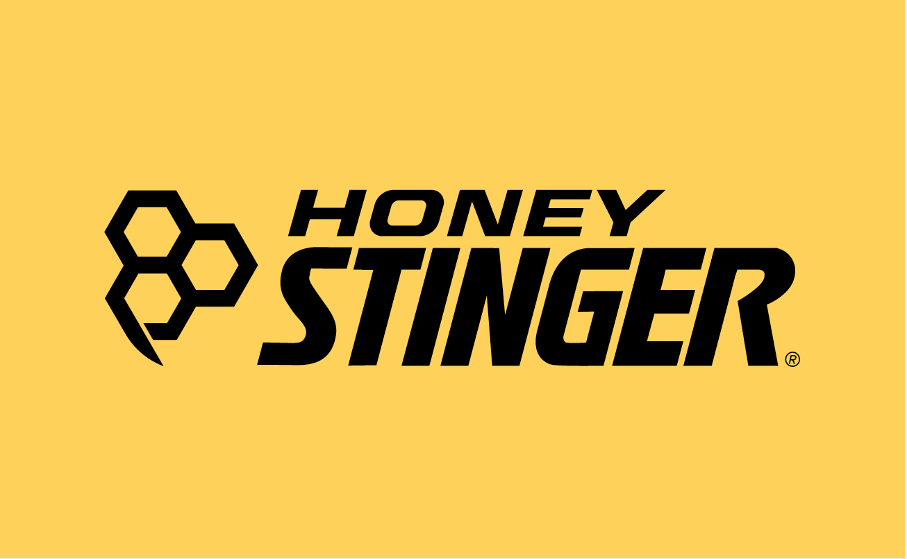
To attract a broader audience looking for natural sports nutrition, Honey Stinger needed a new mark. We transformed their complex (read difficult to print) logo into a simple, bold mark that looks hot on everything from athlete jerseys to shwag to packaging. For brand continuity, we refined their original, hand-done type by removing the "stingers" and improving the letterforms.
“We’re all really impressed with the Walden Hyde team. They worked hard to make everyone feel heard, while still offering creative expertise.”
—Rich Hager
Honey Stinger Co-Founder
And Cohesive Packaging
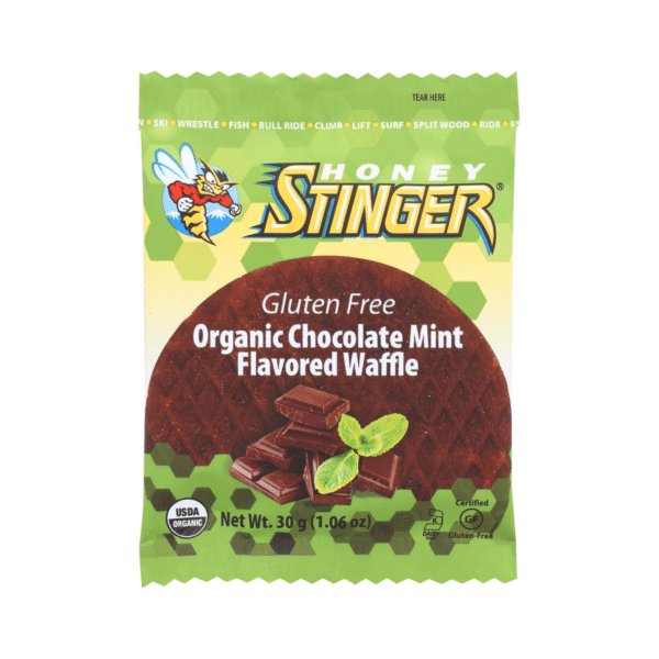
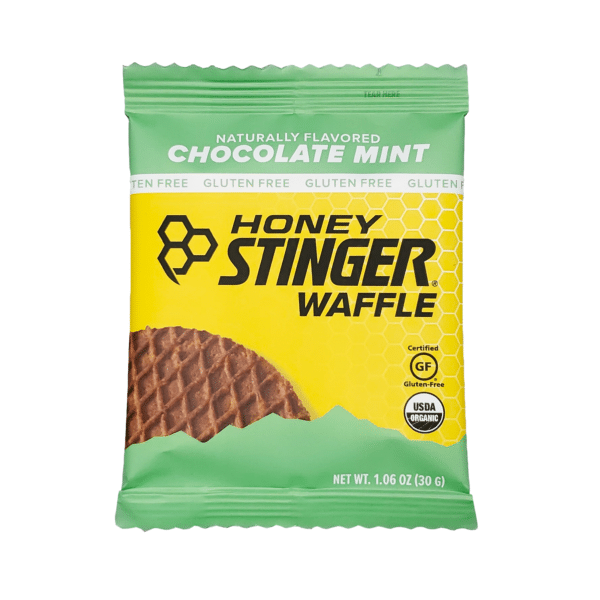
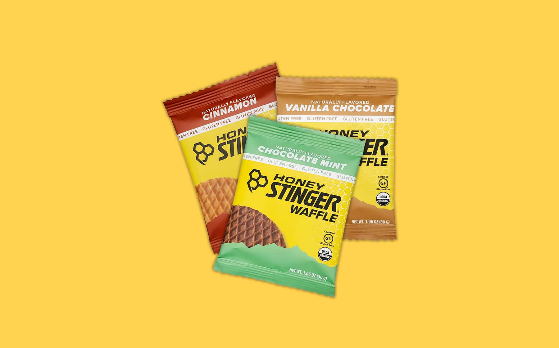
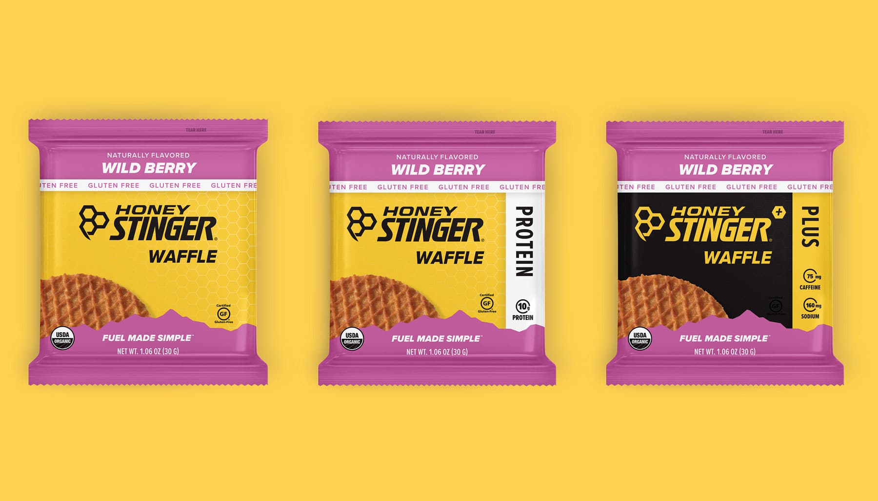
Honey Stinger's busy packaging often got lost at shelf. We simplified the design and introduced strong information hierarchy and visual cues to help consumers shop quickly and effectively. As a result of this work, we produced a 104% increase in sales lift.