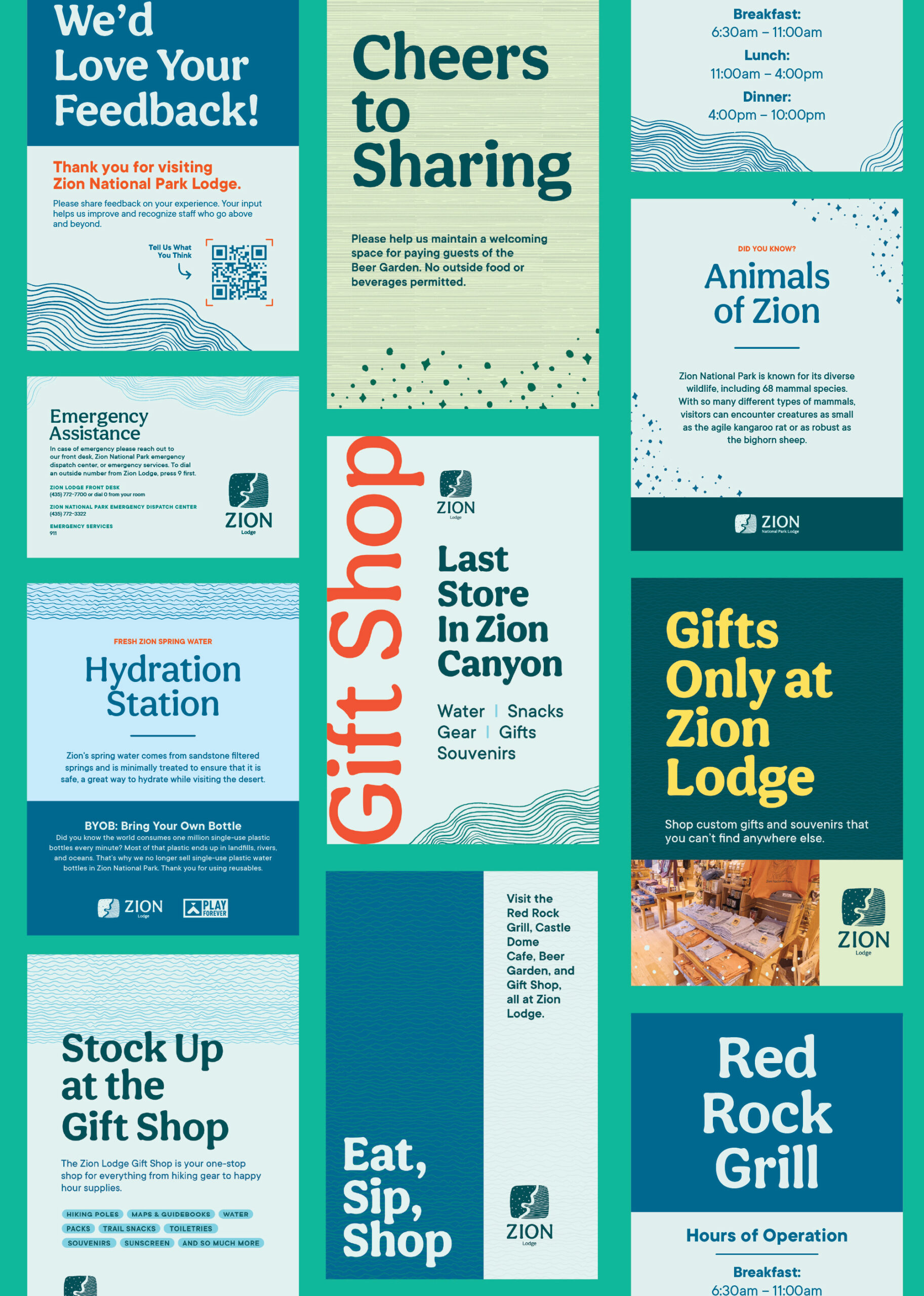
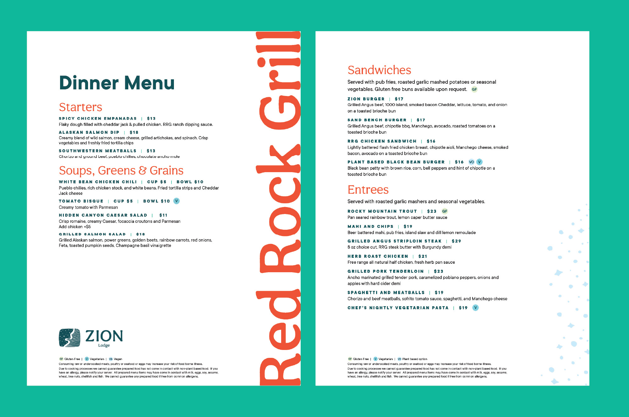
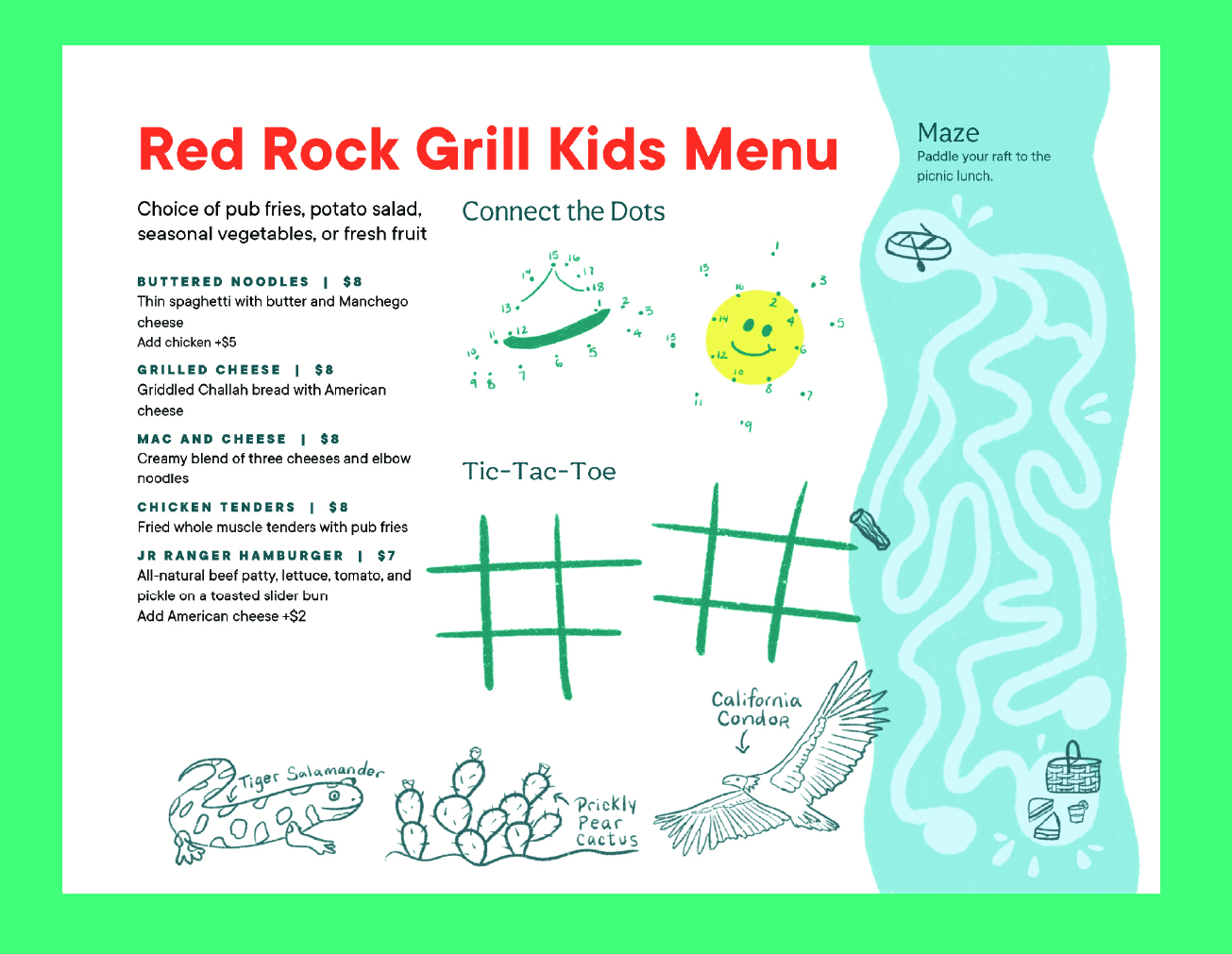
A rebrand that goes beyond the expected in this iconic National Park.
While competitors default to predictable desert oranges, we looked deeper—literally.
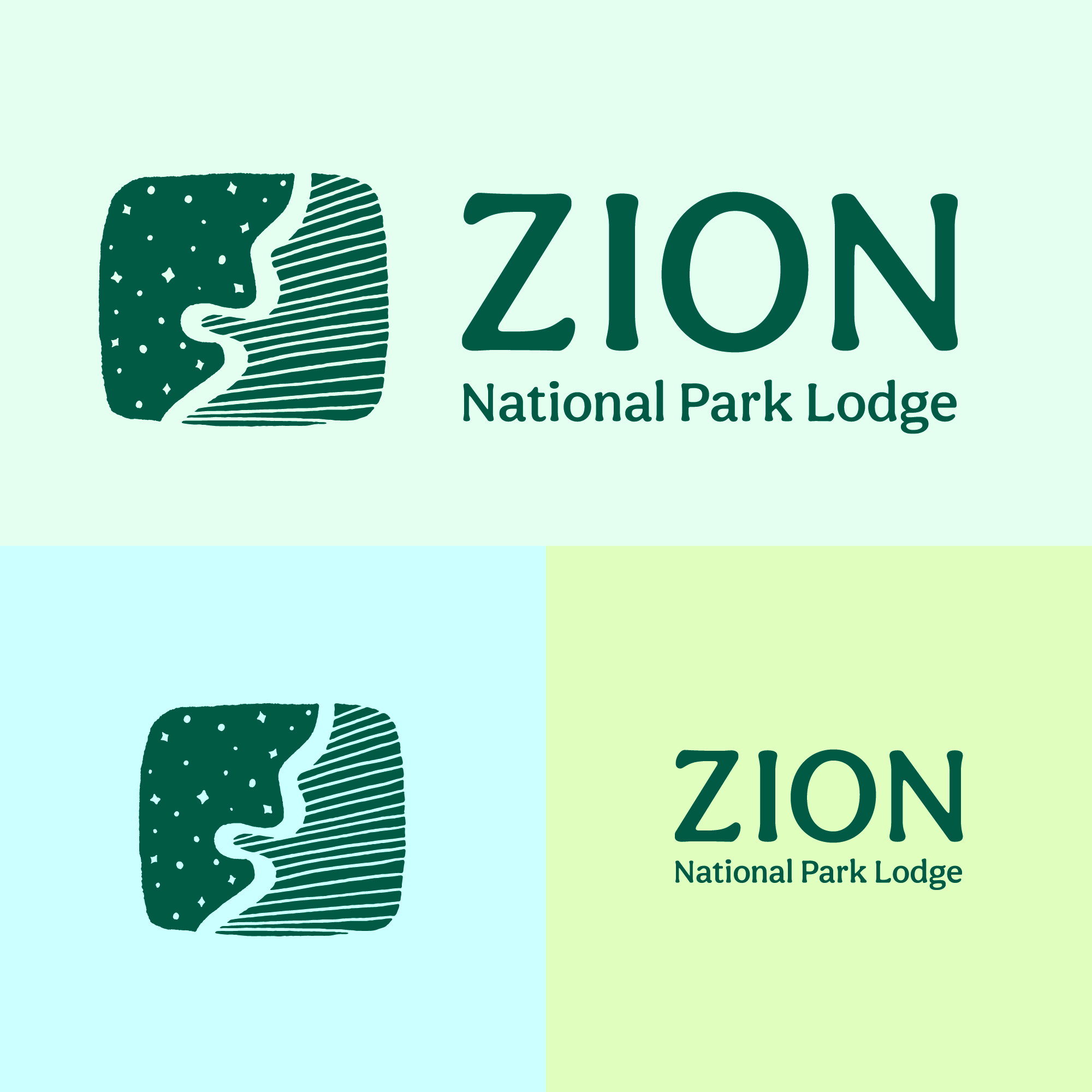
Our Zion Lodge rebrand draws inspiration from the Virgin River carving through ancient canyon walls, the stunning geologic layers that tell millions of years of stories, and the pristine night sky that earned Zion its International Dark Sky designation.
The result?
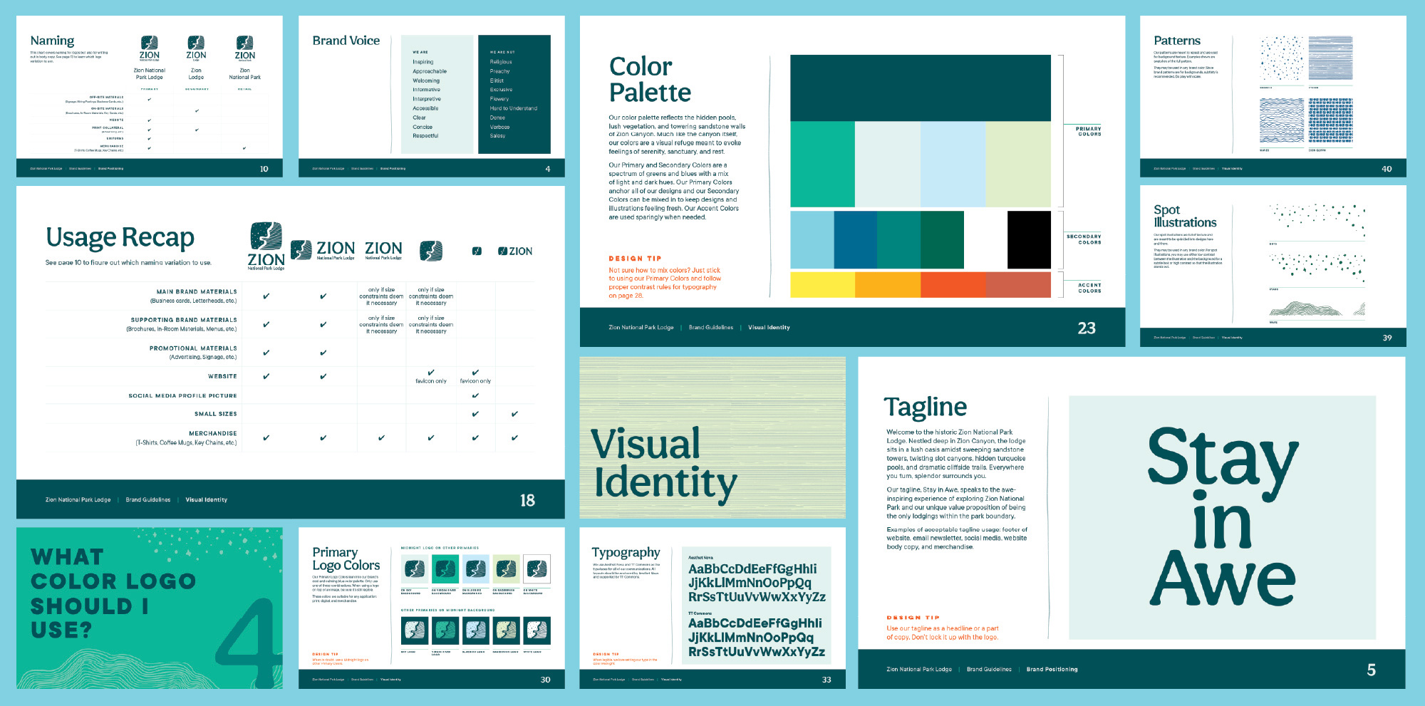
A refreshing color palette that celebrates the lodge as a true oasis—think cool water, hidden grottos, and those famous emerald pools that offer sweet relief from the desert heat.
Because sometimes the most powerful brand story isn’t what you’d expect to see, but what you desperately need to feel.
The real magic happens when a rebrand lives and breathes in the world—not just in a deck.
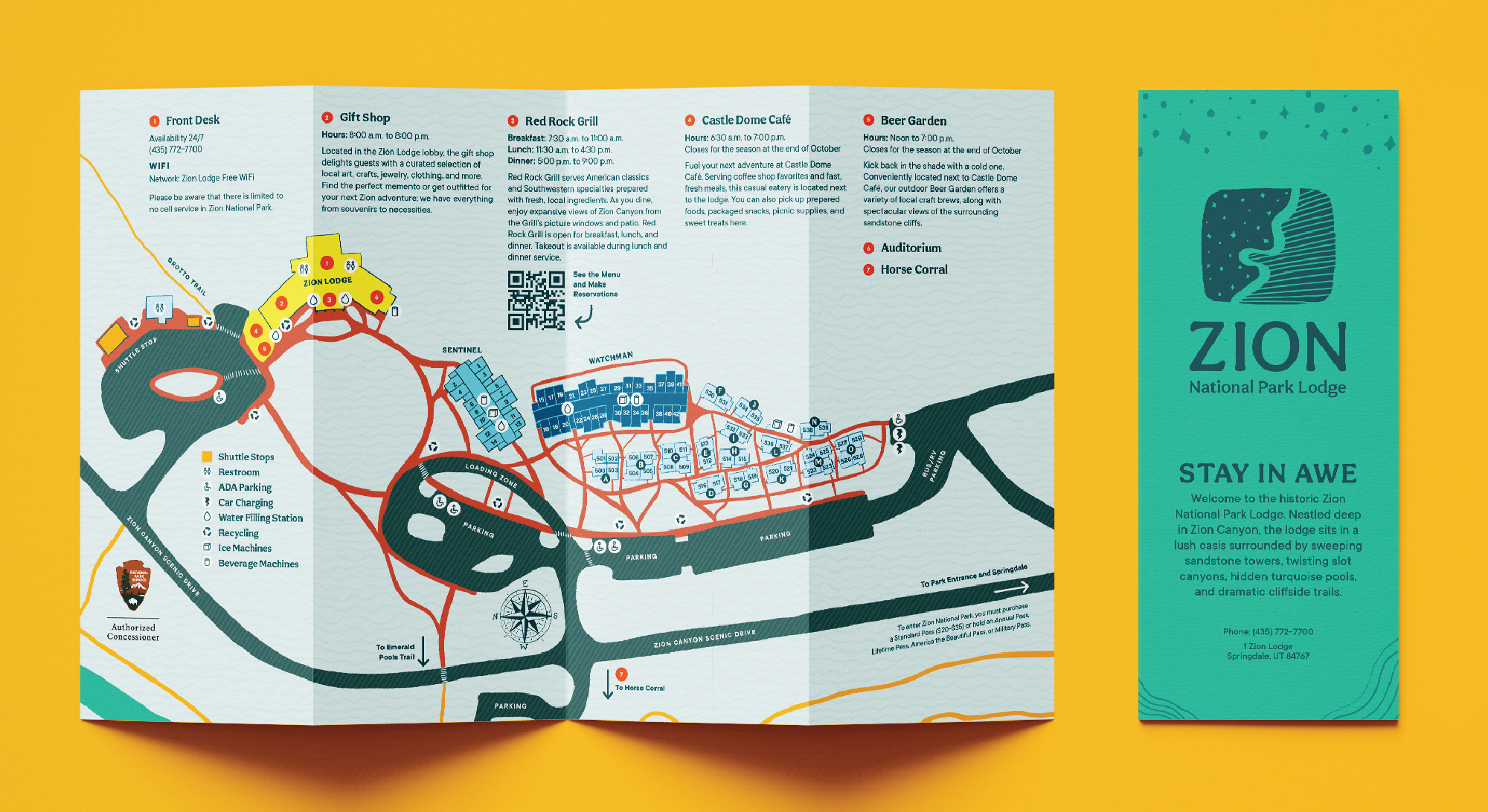
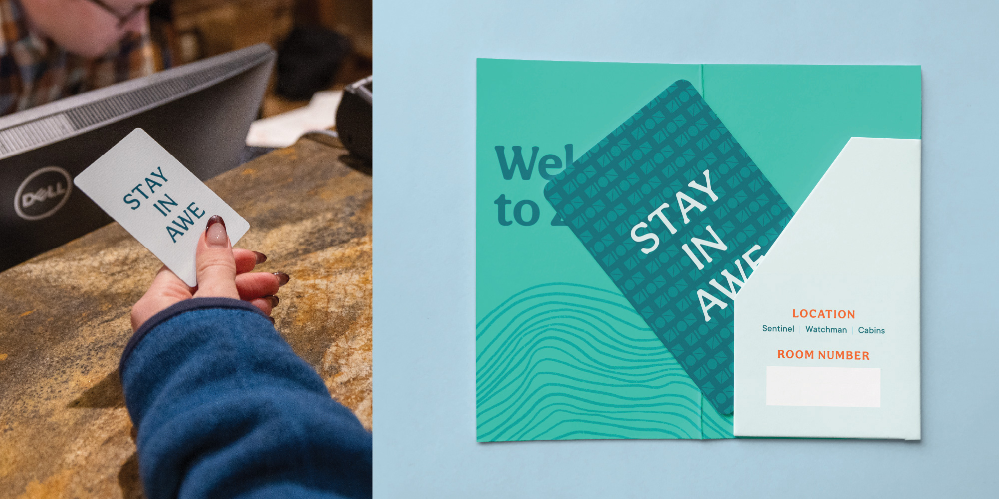
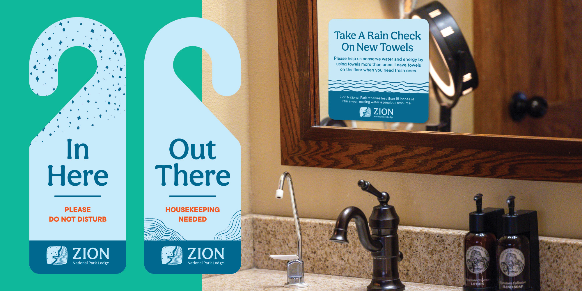
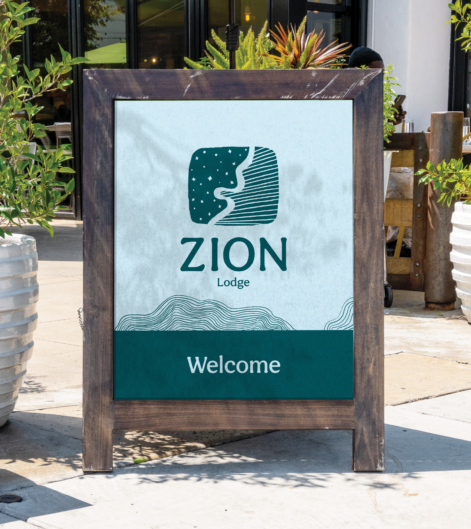
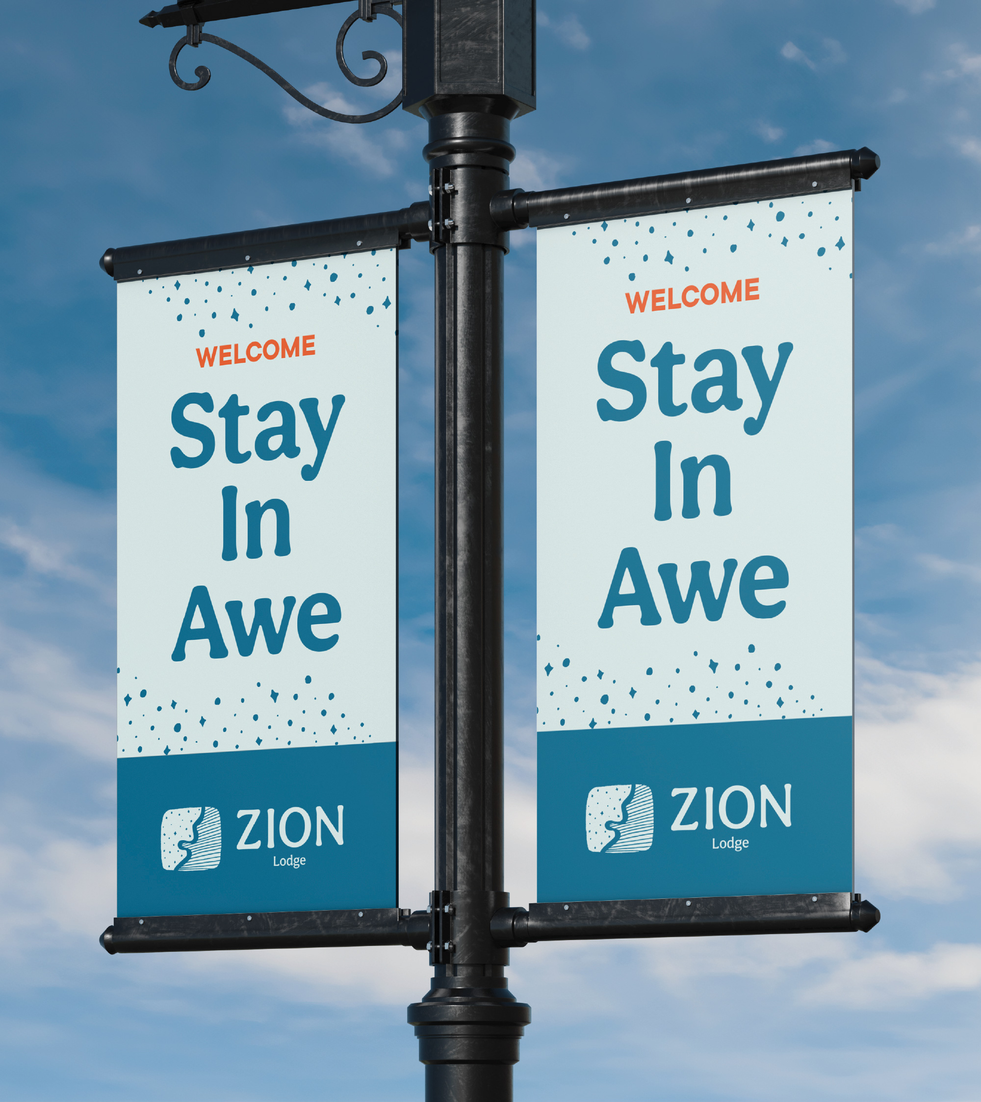
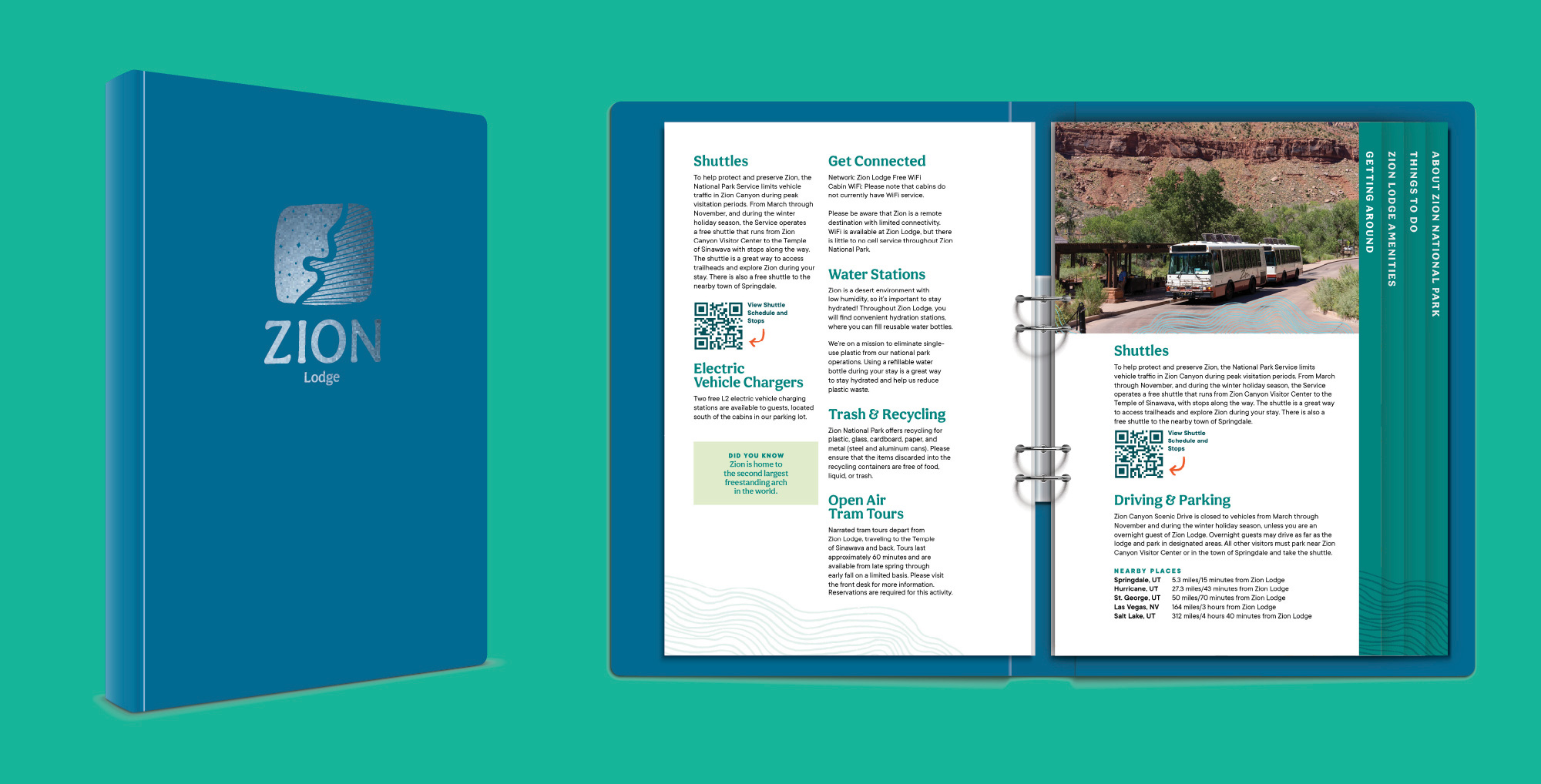
From key cards that guests pocket as keepsakes to wayfinding that guides them to hidden gems, every touchpoint reinforces Zion Lodge as that refreshing oasis experience.
Because a brand isn’t just a logo; it’s every moment your audience interacts with your story. And this story? It’s written in cool blues and canyon greens across every surface that matters.
Director, Digital Performance Management, Powdr